
The Evolution of a Book Cover: When Art Meets Marketing
I have four versions of my book cover sitting in a folder on my desktop. Every time I open it, I feel this little pang - not quite regret, but something adjacent to it. Maybe it's nostalgia for versions that felt more me, or maybe it's just the sting of learning that publishing a book means making your deeply personal work palatable for public consumption.
Let me walk you through how we got here.

Version 1: Brand Consistency Over Everything
The first cover was my own creation in Canva. Clean typography, that split design with cream on top and dark gray on the bottom. The orbital imagery aligned with my logo, the color scheme matched my website. "The Emotional Architect: Engineering The Human Variable For Technical Excellence" in gold text over what looked like a technical schematic.
This was pure brand extension - taking my existing visual identity and slapping it on a book cover. The problem? I was designing for continuity with my website, not for a book that needed to compete for attention in a crowded marketplace. I was thinking like someone who already had an audience, not like someone trying to earn one.
Version 2: The One I Loved
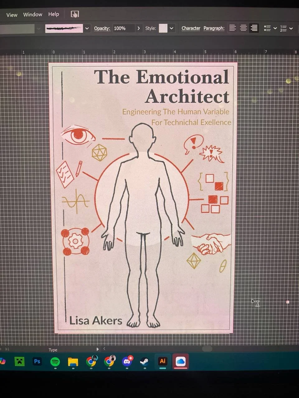
When I hired a professional cover artist, everything changed. He came back with this beautiful, warm, illustrative design - a peachy cream background with a simple human figure outline in the center, surrounded by iconography representing the book's key themes. An eye for reading the room. A handshake for building relationships. Organizational charts for systems thinking. Gears and geometric shapes. Little visual representations of all the concepts I'd spent a year writing about.
I loved this cover. Loved it. The soft palette, the hand-drawn quality, the way it centered the human element - this was the cover that spoke to me as an empathic person who cares deeply about the emotional labor of technical leadership.
My editor gently pointed out what I couldn't see because I was too close to it. The cover was too busy. All that meaningful iconography that told a complete story up close became visual noise at thumbnail size. The soft color palette didn't have enough contrast to pop on a bookstore shelf or in an Amazon search. Every one of those little icons required interpretation, and a browser has maybe two seconds to decide if they're interested.
The cover I loved would get lost.
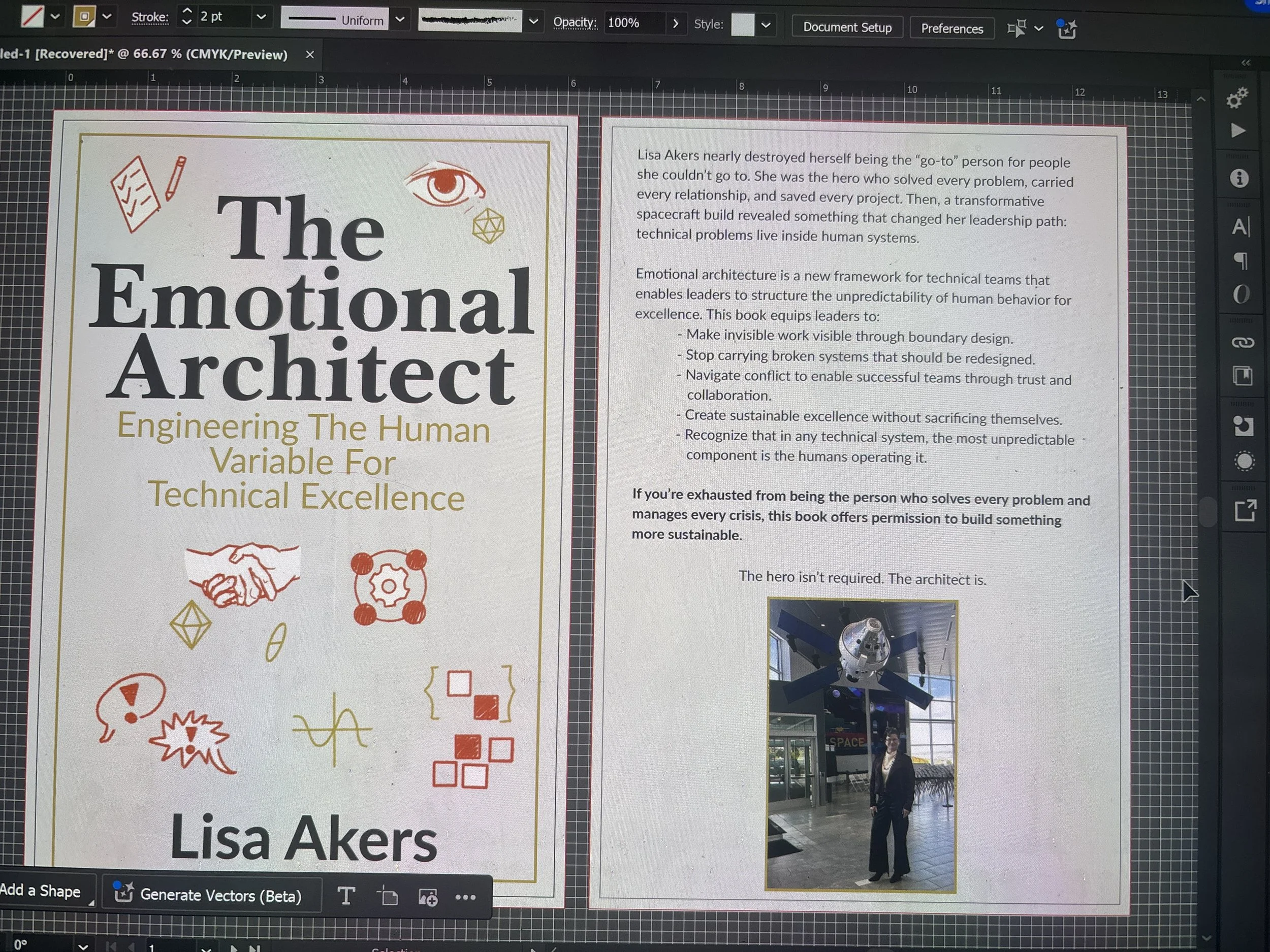
Version 3: Simplification Attempt
We tried to salvage the original approach. Kept the iconography, removed the central human figure, cleaned up the layout. Same warm tones, same gold accents, less cluttered.
It still didn't pass the bookstore shelf test.
This is where I started to understand book sales: a book cover is marketing. Its job isn't to fully represent everything the book contains or to be the most aesthetically pleasing design. Its job is to make someone stop scrolling, reach out their hand, and pick it up. We were solving the wrong problem!
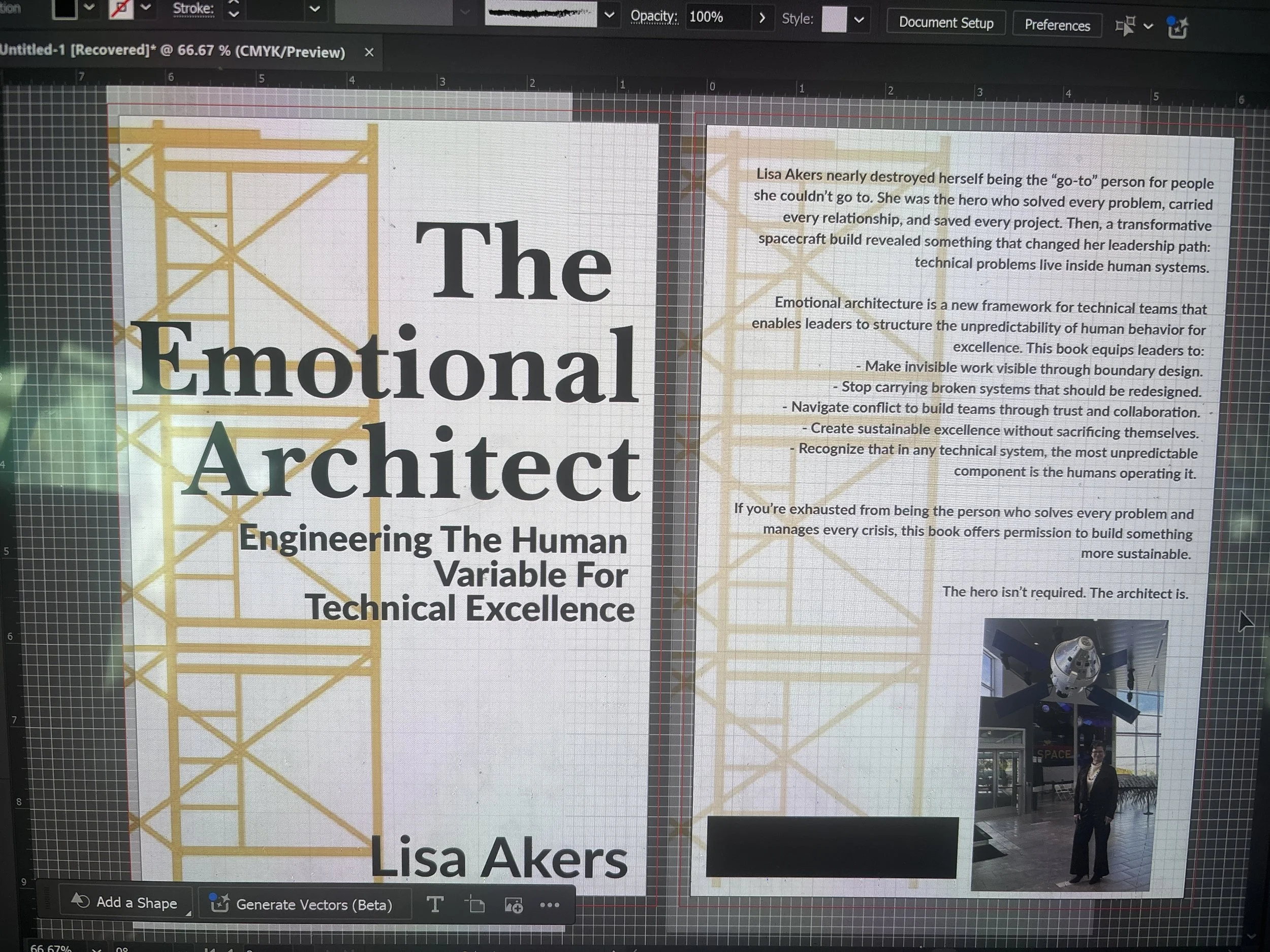
Version 4: The Landing
My cover artist and I sat down and looked at successful books in my space. We studied what worked - not what we liked, but what actually moved copies. Bold graphics. High contrast. Simple, readable imagery that communicated something clear at a glance.
We landed on scaffolding.
Actual architectural scaffolding in gold/orange tones against a clean white background. The metaphor is literal - you're building something, there's structure and support, it's a framework you can trust. The "emotional architecture" concept right there in the visual without requiring any decoder ring to understand it.
Is it my favorite aesthetically? No. I still open that folder and look at Version 2 with longing.
Version 4 does something Version 2 couldn't - it grabs attention. It reads clearly at thumbnail size. It communicates "professional and approachable" and "structured while human" without making readers work for it. It looks like it belongs next to the other leadership books people are already buying.
I'm Still Processing
There's been a lot of editing in this book journey. Cutting personal stories that felt essential. Modifying language to be more accessible. Restructuring chapters to serve the reader's learning curve instead of my own processing order.
The cover evolution is just another version of that same work - taking something deeply personal and shaping it for public consumption. It stings a little. This book is my lived experience as a technical leader who nearly destroyed herself being the hero, then discovered a better way. Having to package that experience in scaffolding imagery instead of the warm, human, illustrated version that felt so right to me... it's a small grief.
The point of writing this book isn't self-expression. If I wanted pure self-expression, I'd keep a journal. The point is to get these ideas into the hands of technical leaders who are struggling the way I struggled - who feel too much, work too hard, and see patterns others miss. Leaders who are burning out trying to be the hero when they really need to become the architect.
If a bold scaffolding design gets more of those people to pick up the book than a soft illustrated cover would, then the scaffolding wins. Even if I'm still a little sad about it.
Publishing teaches you to hold your work with an open hand. To care deeply about what you've created while also accepting that bringing it to the world means making compromises you didn't anticipate. To recognize that the version you love and the version that serves your mission might be different things.
I'm capturing these earlier versions here because they deserve to exist somewhere. They represent real thinking about what this book is and what it means. They're the deleted scenes, the director's cut, the version that felt most true even if it wasn't most effective.
Version 4 is what you'll see on shelves this spring. I think - I'm still learning to think - that's okay. The book inside is still the same. The framework is still there. The emotional architecture that helps technical leaders build sustainable excellence without sacrificing themselves - that hasn't changed. We just had to build better scaffolding around it to make sure people could find it.
Get updates on the book, access to bonus content, and the latest technical leadership insights from me when you get my Technical Leadership Thursday email!